Sportelo
Visual direction and product redesign for a sports platform.
- Scope
- UX/UI, Branding
- Role
- UX/UI Designer
- Client
- Sportelo
- Year
- 2025–2026

Overview
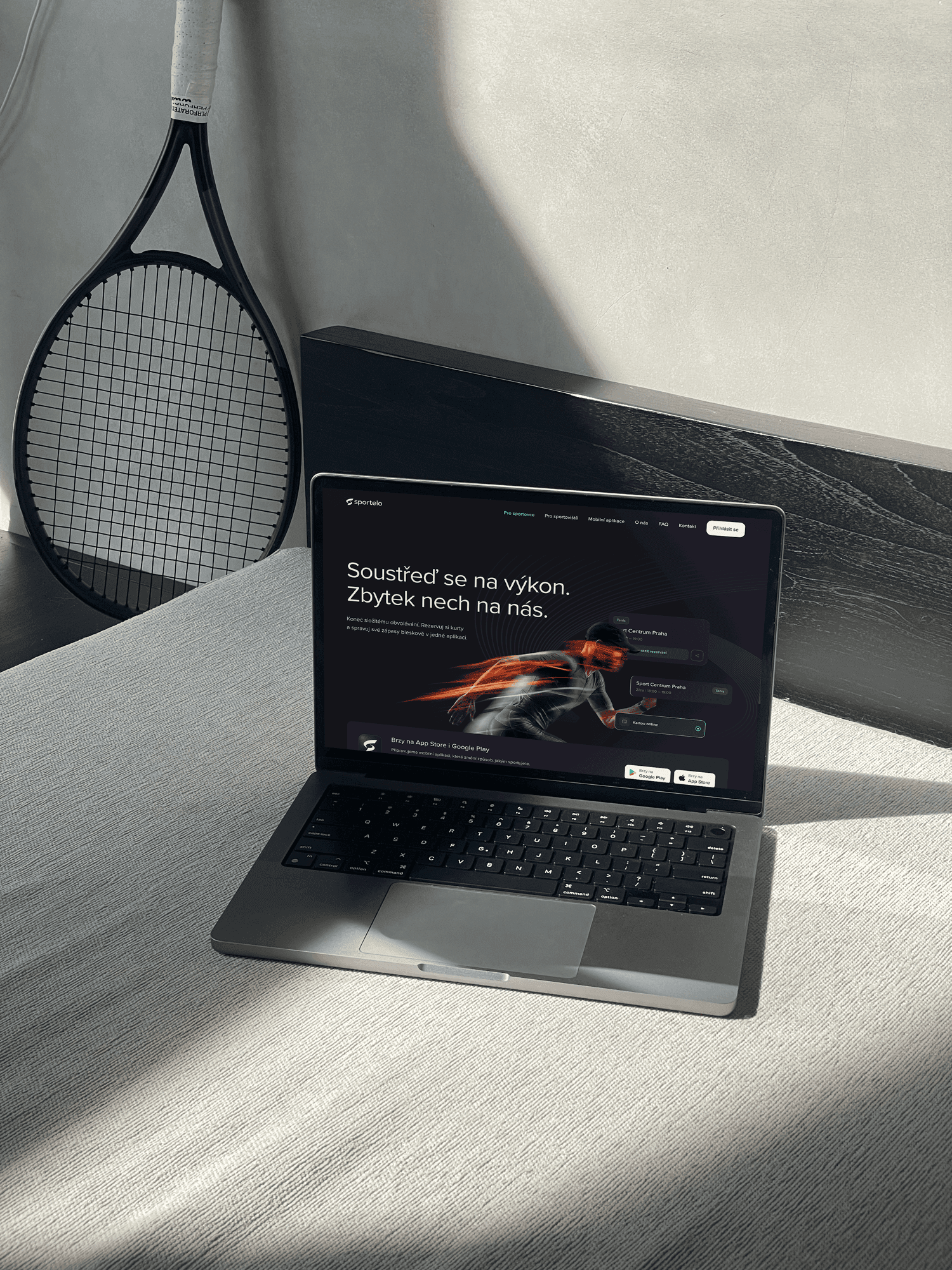
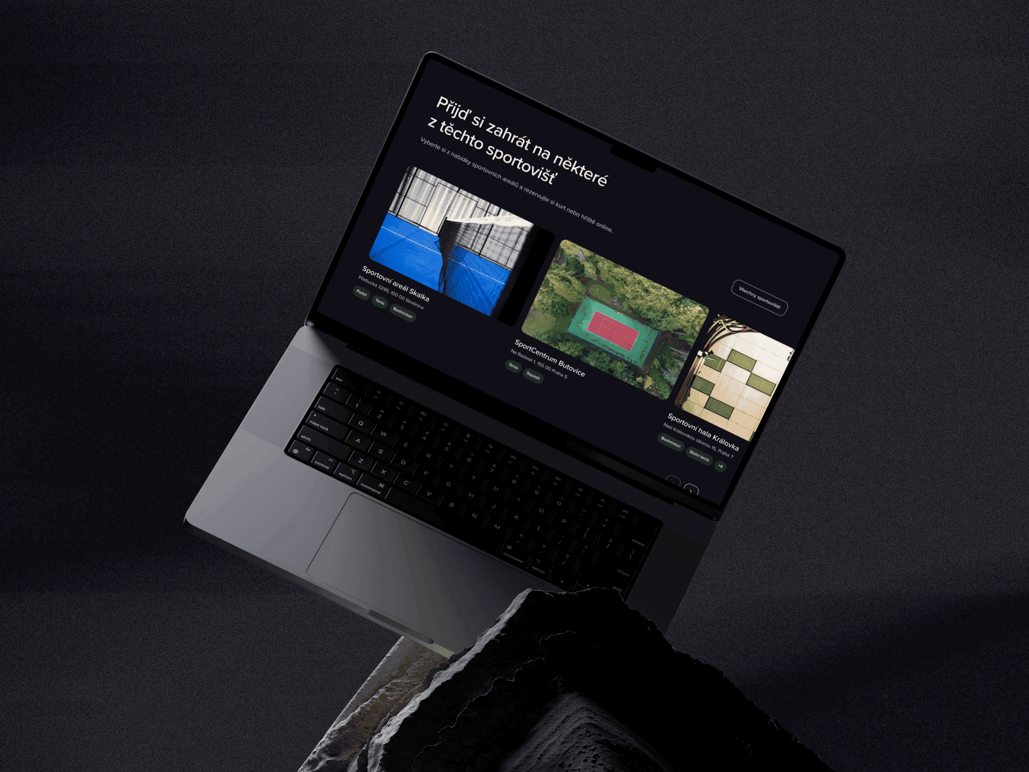
Sportelo is a sports platform where the goal was to move the visual identity forward and create a new direction for its digital products, mainly the website, booking system, and mobile app.
I worked on the project as a UX/UI designer. My role included exploring a new visual direction for the brand, designing selected digital parts, and redesigning the booking system and mobile app. The goal was to create a more modern, energetic, and consistent digital experience that would better fit the sports environment.
Challenge
The project combined several areas at once: visual identity, website, booking system, and mobile app. The challenge was to design product-related parts while the brand direction was still evolving.
Colors, typography, and the overall visual tone were being refined throughout the process, which naturally affected the UI work as well. The design process required flexibility, fast iterations, and the ability to adapt to new decisions without losing the overall direction.
It was important to create something that would not work only as a one-off visual update, but as a usable foundation for future digital outputs of the brand.
Approach
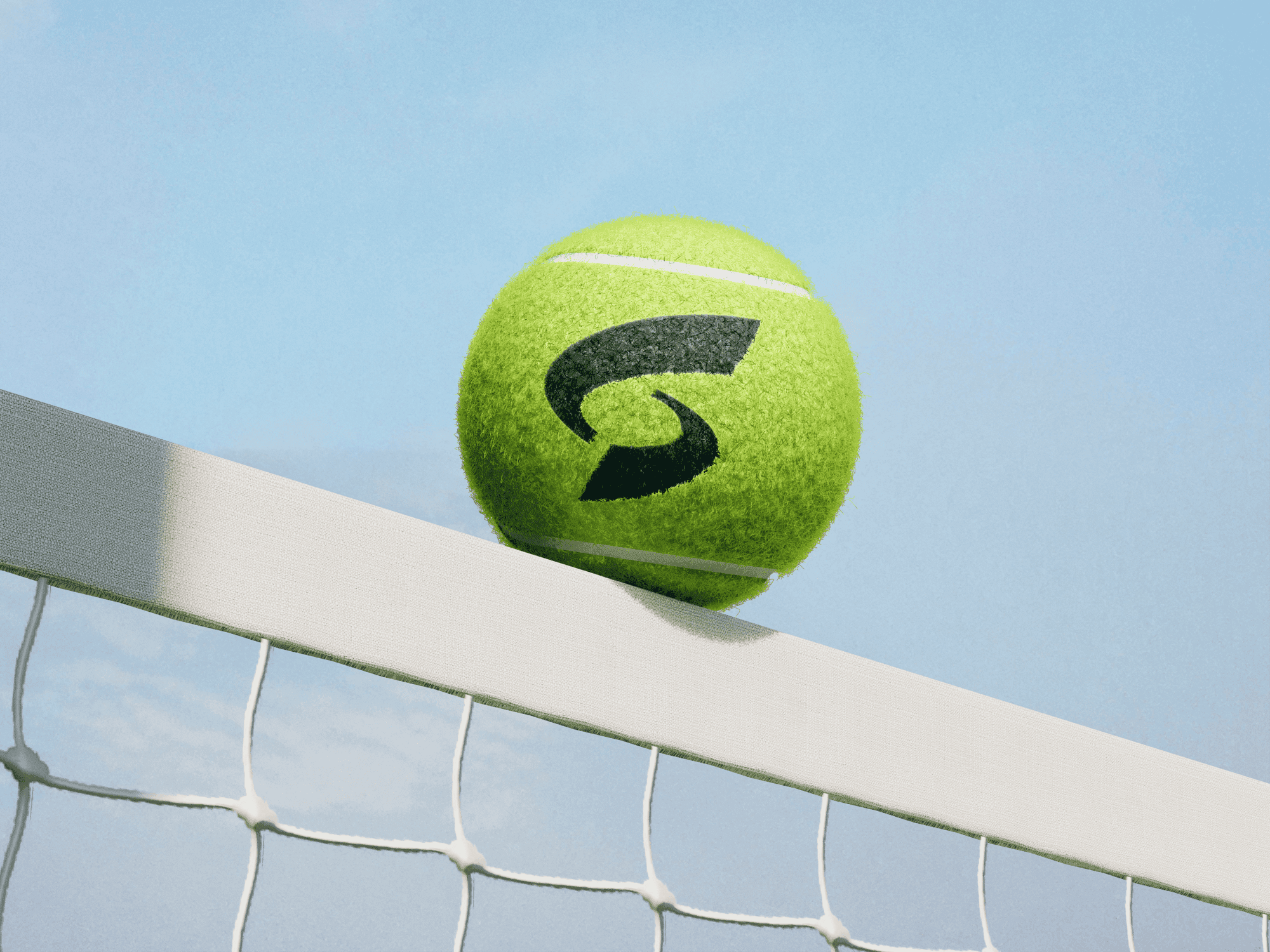
I started by exploring a visual direction that could give Sportelo a stronger character and better express the energy of a sports platform. I worked with colors, typography, UI elements, and the overall brand feeling to make the product feel more modern, dynamic, and consistent across different touchpoints.
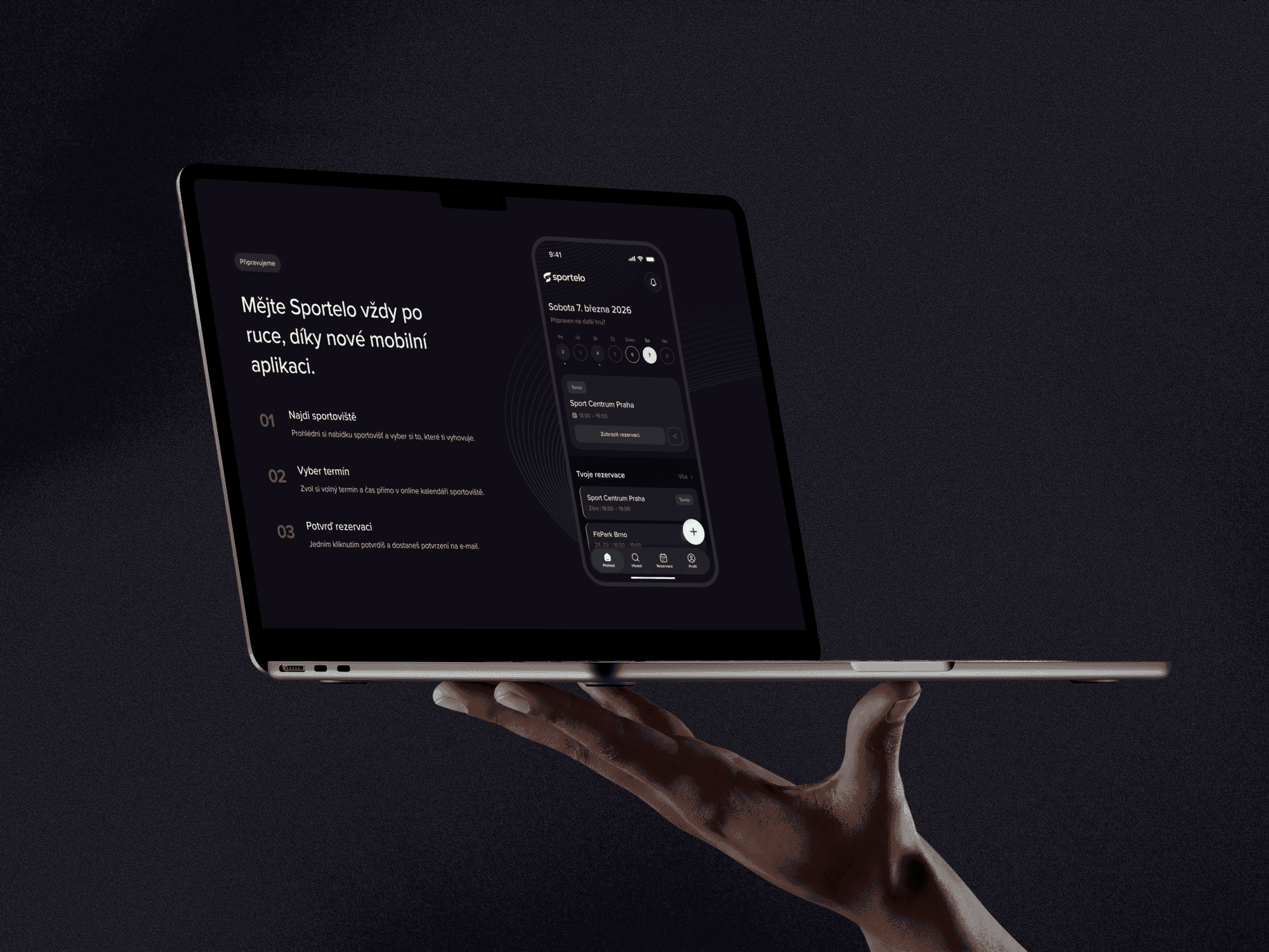
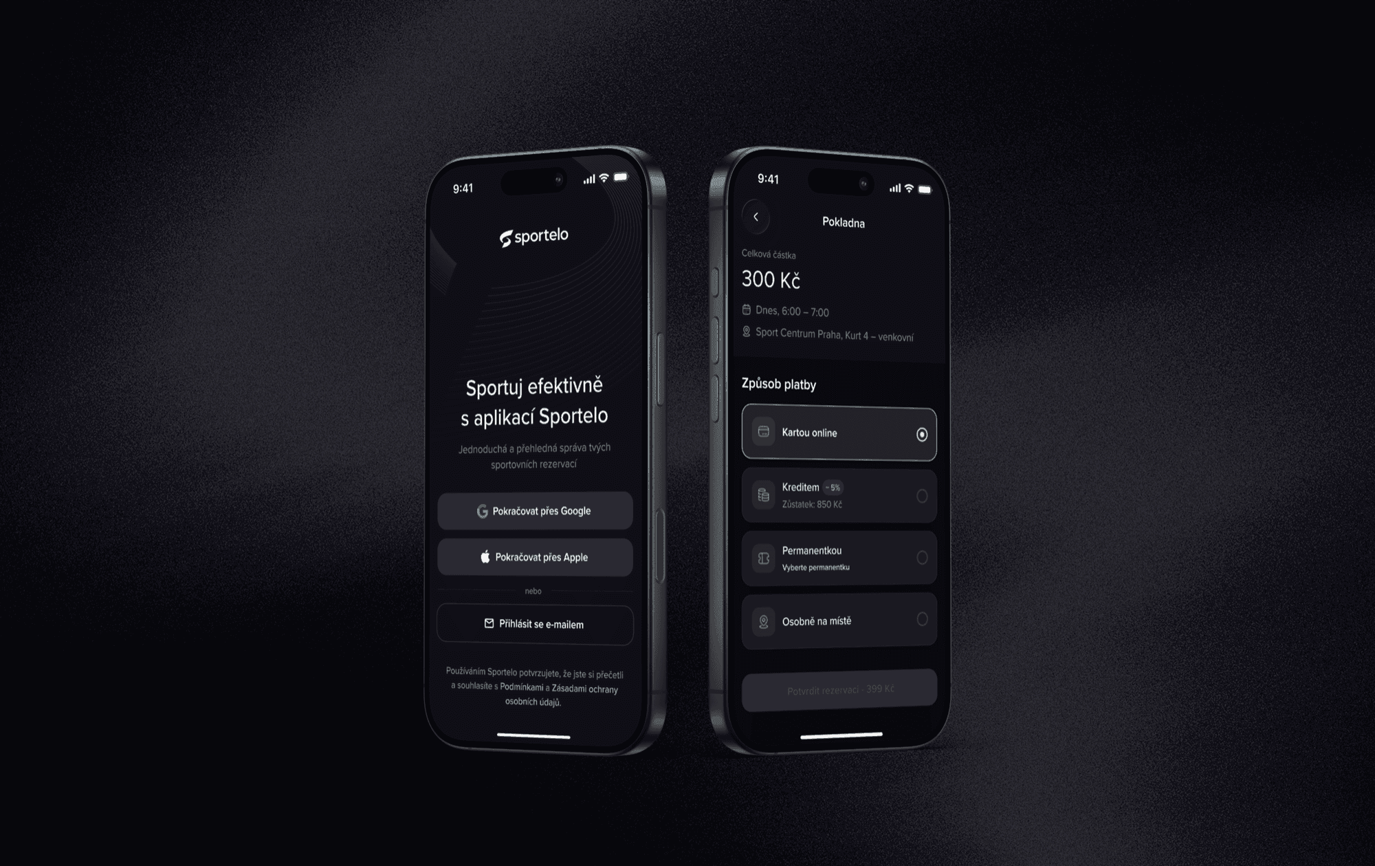
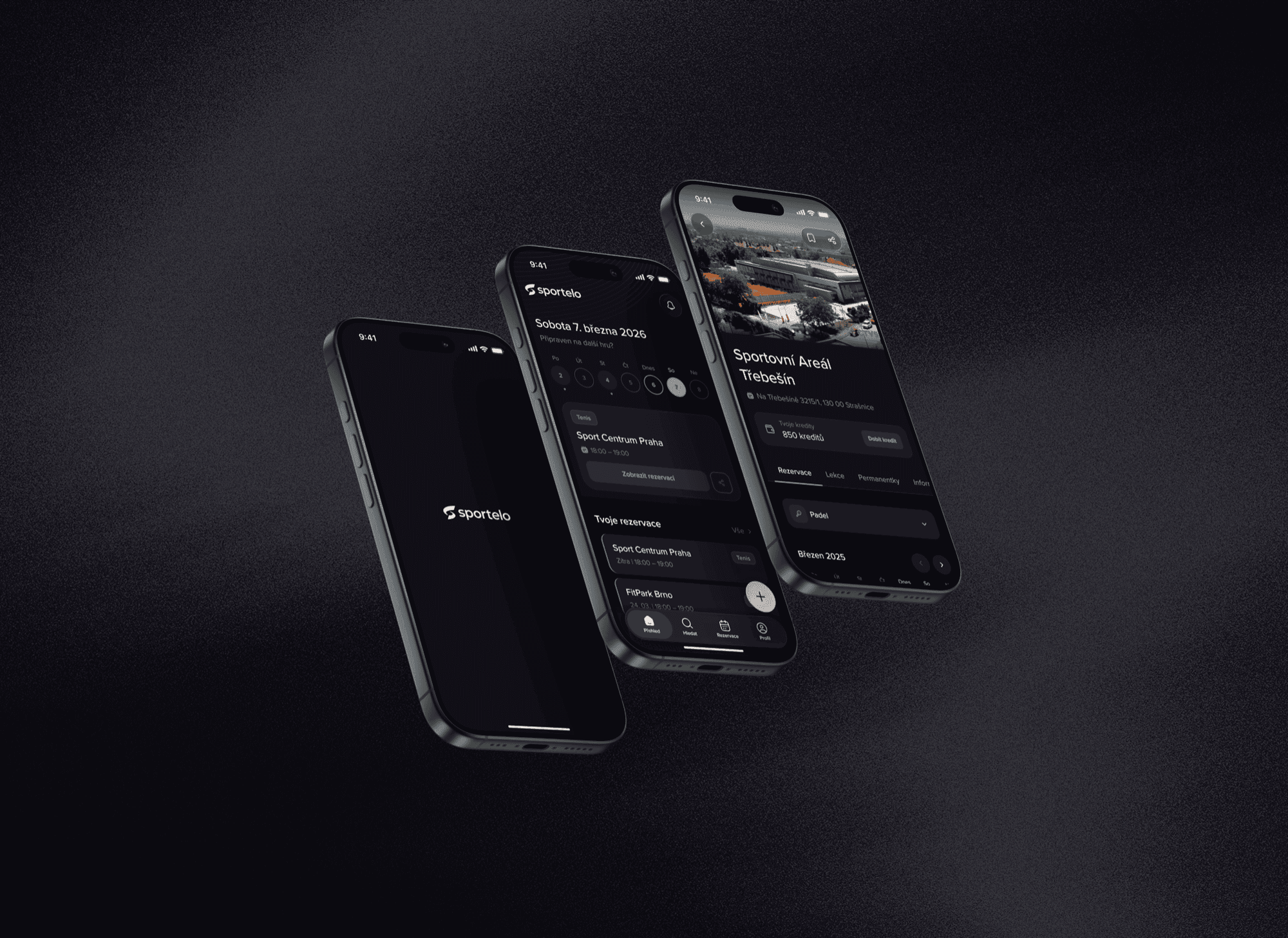
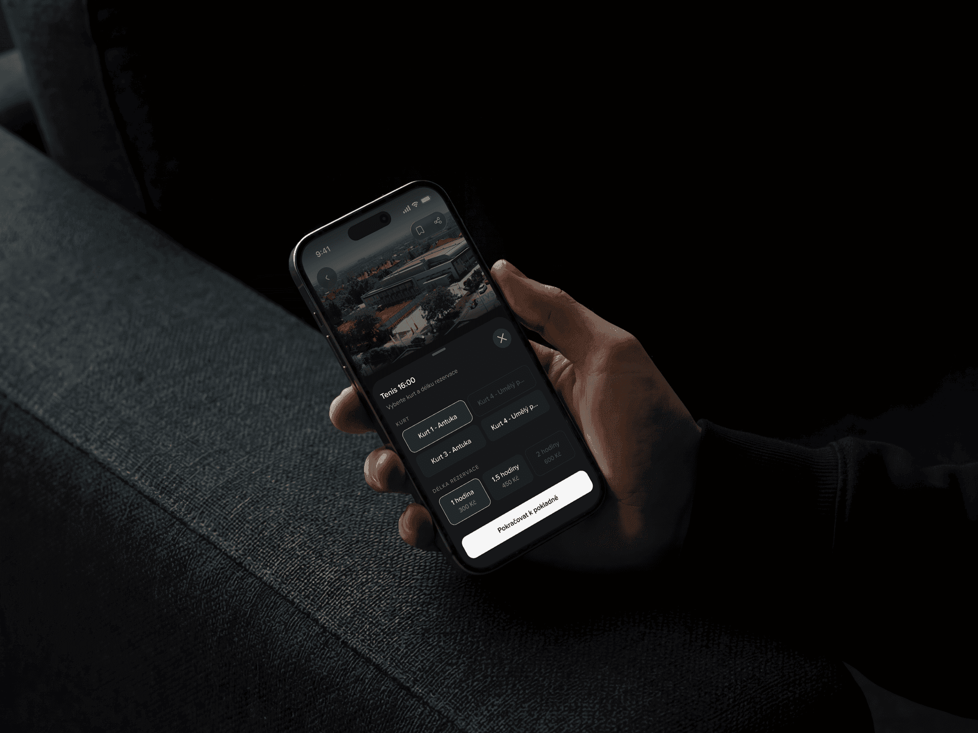
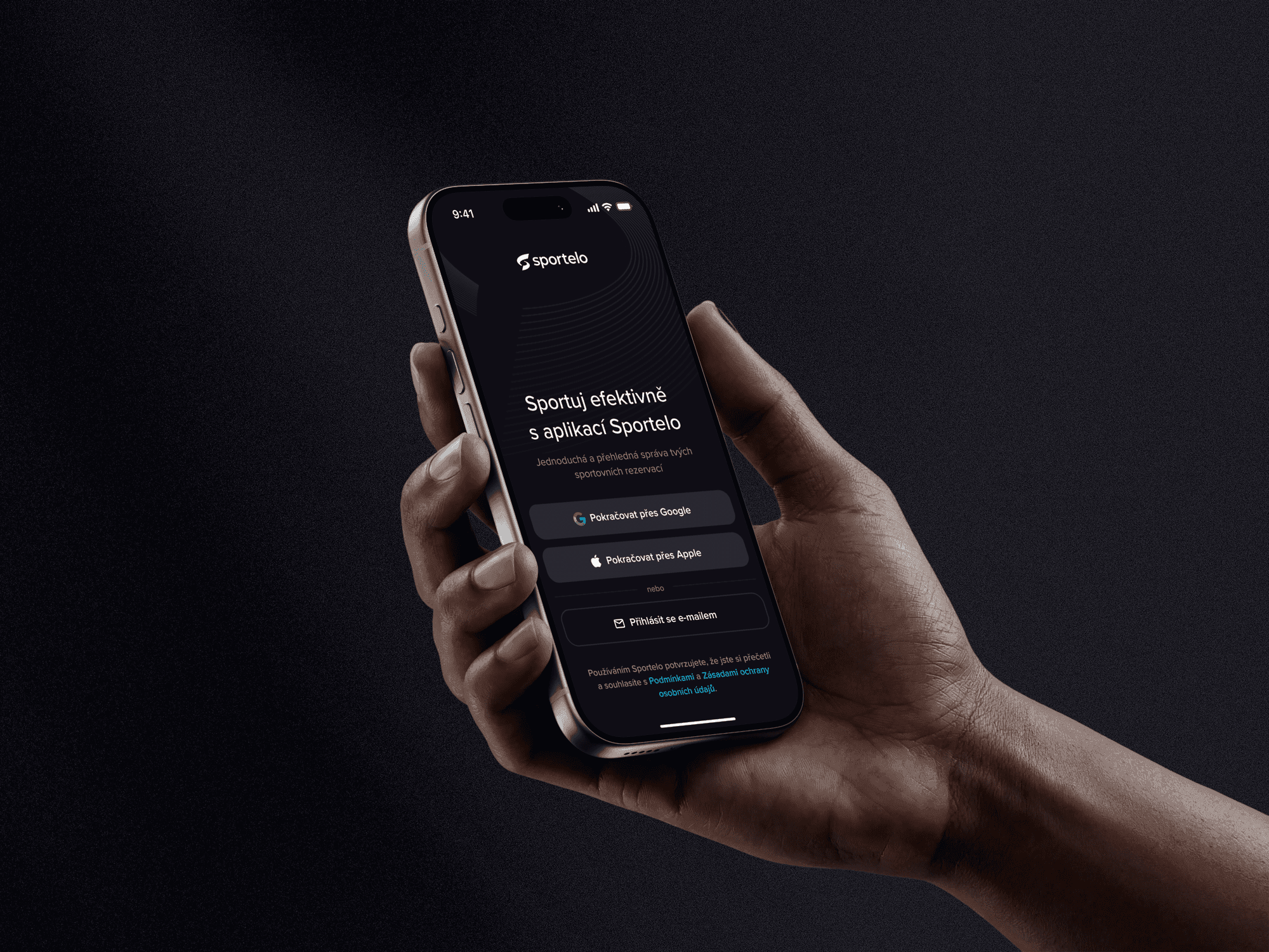
The work also included redesigning the booking system and designing the mobile app. For the booking system, I focused mainly on clarity, easier orientation, and more visible key actions. For the app, the focus was on defining the visual style, screen structure, and the overall feel of the experience.
Because the project moved quickly, the design process had to be pragmatic. Some parts were developed as more detailed product designs, while others served as a direction that the team could continue building on. The priority was to move the brand and product forward and create a foundation that could be further developed.
Outcome
The result was a set of visual proposals and product directions that helped move Sportelo toward a clearer digital style. The project created a foundation for further work on the brand, booking system, and mobile app.
The designs helped align the visual direction, explore possible product improvements, and give the team concrete material to build on. The project also highlighted how important a stable brand foundation is when designing larger digital products.


Let’s work together
