Eqvista
Designing a mobile app for an equity management platform
- Scope
- Mobile app design
- Role
- UX/UI designer
- Client
- Eqvista
- Year
- 2025–2026

Overview
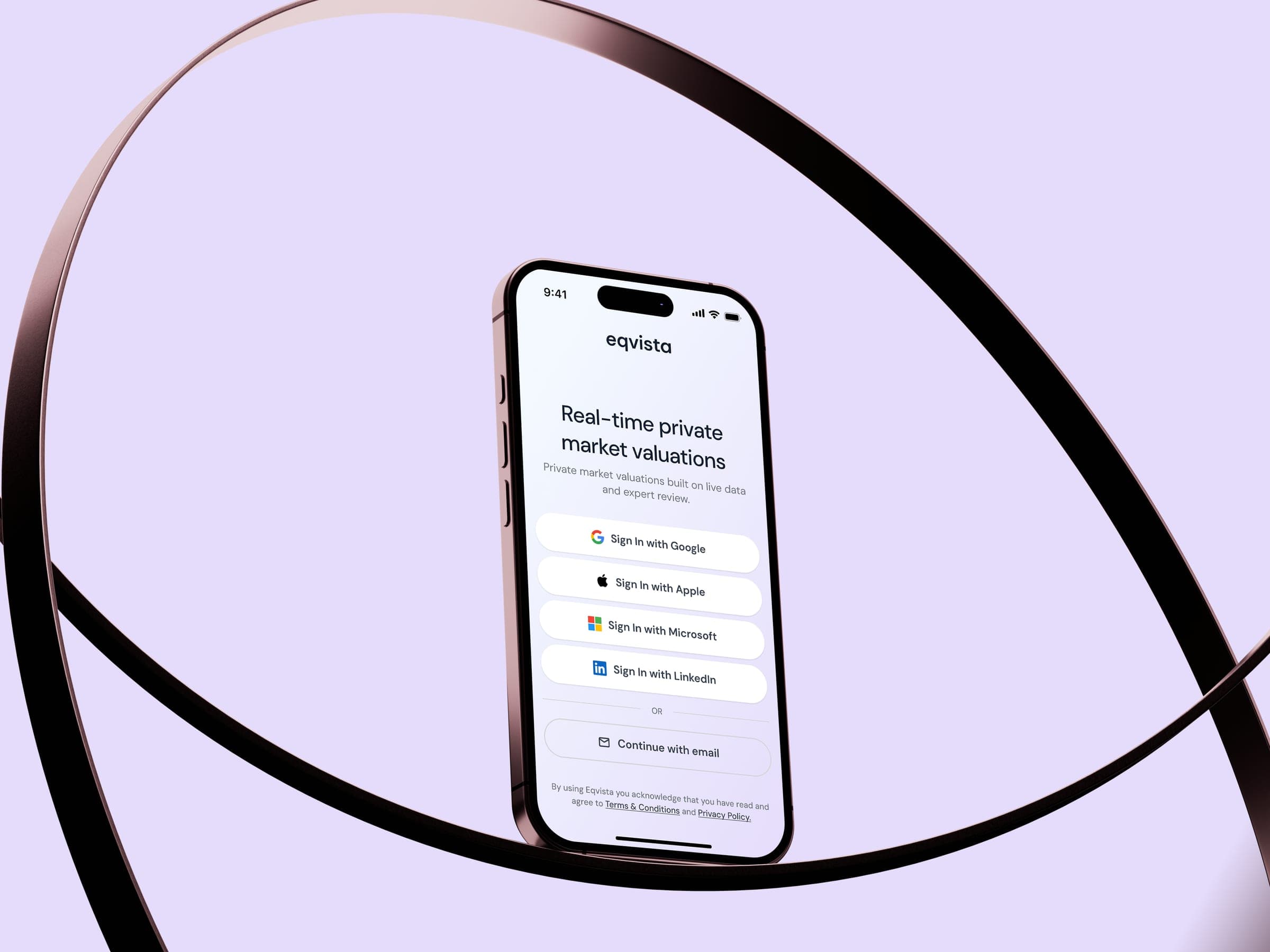
Eqvista is a platform focused on equity management, cap tables, company valuations, and shareholder-related workflows. The client already had an existing web platform, a defined visual identity, and a clear set of product features. The goal of the project was to design a mobile app that would naturally extend their existing digital product ecosystem.
I worked on the project as a UX/UI designer. My role included designing the mobile interface, joining online client meetings, and collaborating closely with the developer to make sure the design was not only visually consistent, but also clear and practical to implement.
Challenge
The main challenge was the tight timeline. The app had to be designed quickly, without room for a long discovery phase or a full product redesign. This meant I had to understand the product fast, identify which parts of the web platform were essential for the app, and translate them into a mobile experience as efficiently as possible.
The goal was not to redesign the product from scratch. The priority was to keep the experience aligned with Eqvista’s existing web platform, respect the brand guidelines, and create a mobile interface that would feel familiar, trustworthy, and easy to navigate.
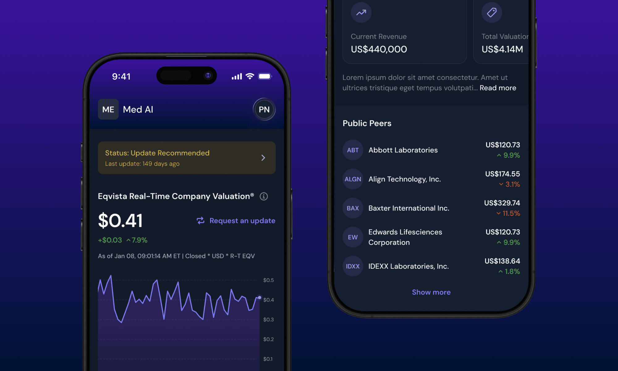
Another important challenge was the nature of the product itself. Equity management, valuations, and financial data require clarity, precision, and trust. The interface had to help users understand key information quickly, navigate complex workflows, and take action without unnecessary friction.

Approach
I started from Eqvista’s existing web platform and brand guidelines. Instead of creating a completely new visual direction, I focused on translating the core product logic and key features into a mobile-first interface that would feel like a natural extension of the existing platform.
My focus was on clean screen structure, readable financial data, consistent components, and simple navigation. For a complex financial product, the interface should reduce complexity rather than add to it. I kept the design clear, functional, and visually calm, so users could focus on the information and actions that matter.
The project also involved close communication with the client. Through online meetings, we were able to validate the direction, respond to feedback, and keep the project moving. I also worked closely with the developer throughout the process to make sure screens, states, and components were clear from an implementation perspective.

Outcome
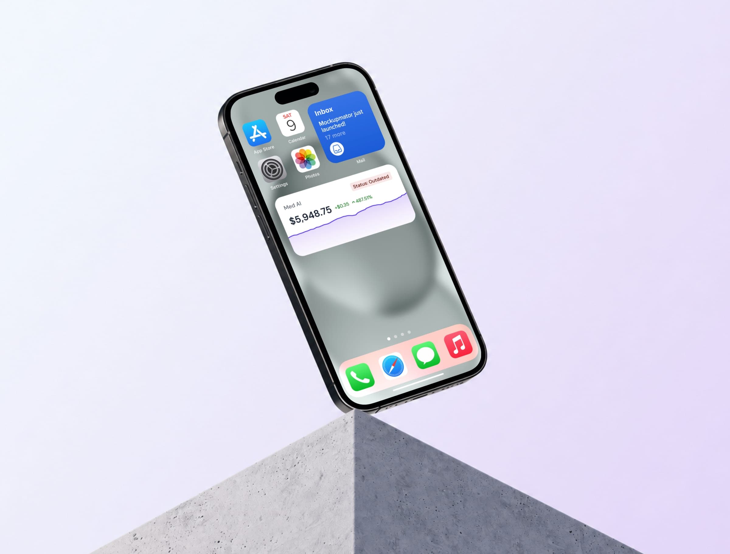
The result was a complete mobile app design that extends Eqvista’s digital product experience beyond the web platform. The app follows the existing brand, supports the core product functionality, and adapts it into a mobile experience focused on clarity, consistency, and usability.
The project shows how a complex financial product can be translated into a mobile interface within a tight timeline by working efficiently with existing product patterns, brand guidelines, and close collaboration between design and development.
The app is now live and available to download on the App Store.


Let’s work together
