Veevoy web
Visual website refresh for a software agency focused on custom development and healthcare projects.
- Scope
- Website, Branding
- Role
- UX/UI designer and brand designer
- Client
- Veevoy
- Year
- 2025–2026

Overview
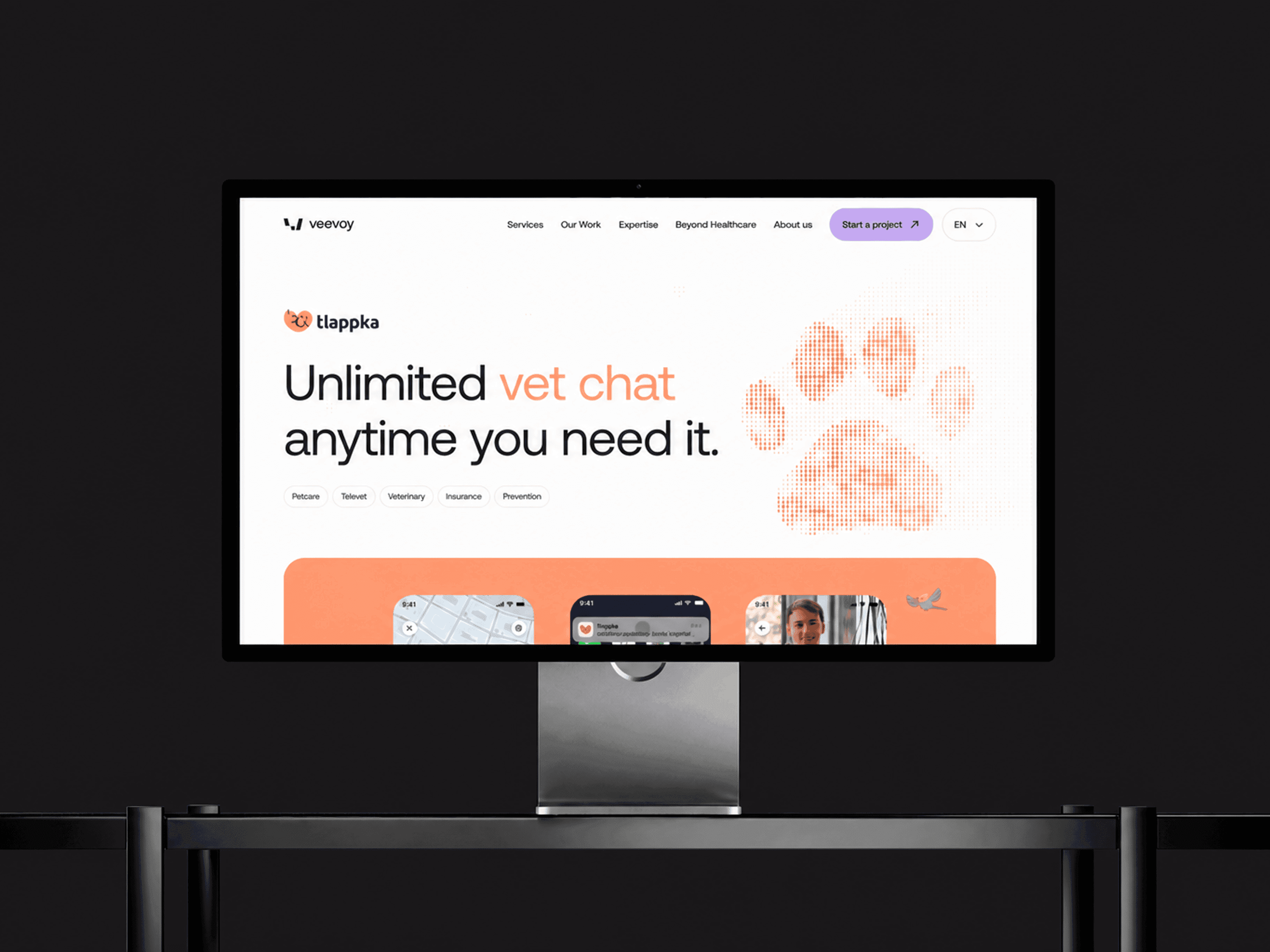
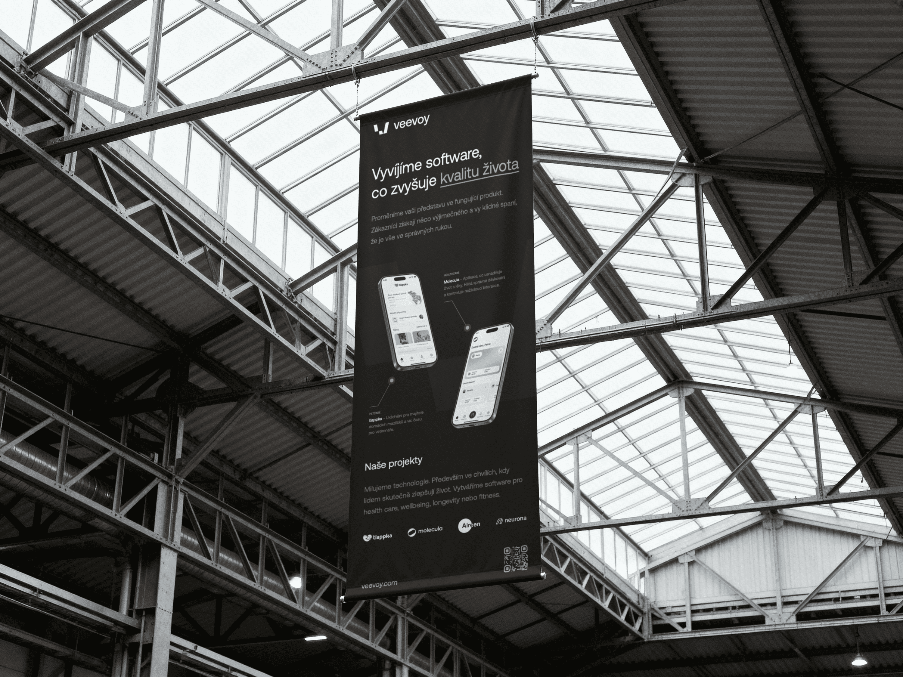
Veevoy is a software agency focused on custom web, app, and digital product development, with a strong focus on healthcare and medical projects. The website already existed, but it felt too generic and lacked a distinctive visual element that would give the brand more personality and make it easier to recognize.
My task was to improve the website visually and conceptually without redesigning everything from scratch. I focused on creating a characteristic brand element that could be used across the website, social media, and other communication materials. I also updated selected existing pages and designed new sections of the website.
Challenge
The main challenge was to improve an existing website in a way that would make the brand feel stronger and more memorable, while still keeping the foundation of the current design. The goal was not to rebuild the whole website, but to identify what was missing and add a visual layer that would make the experience more distinctive.
The original website was clean and professional, but it lacked a unique visual language. For a software agency that needs to feel trustworthy, modern, and slightly different from competitors, it was important to create a brand element that could support long-term recognition.
The hardest part was finding the right visual motif. It had to be distinctive enough to make the website feel less generic, but flexible enough to work across different pages, formats, and communication channels.
Approach
I started by exploring a visual principle that could give Veevoy a stronger and more ownable brand character. The goal was not to create a one-off decoration for a single section, but a scalable visual element that could be reused and developed across the brand.
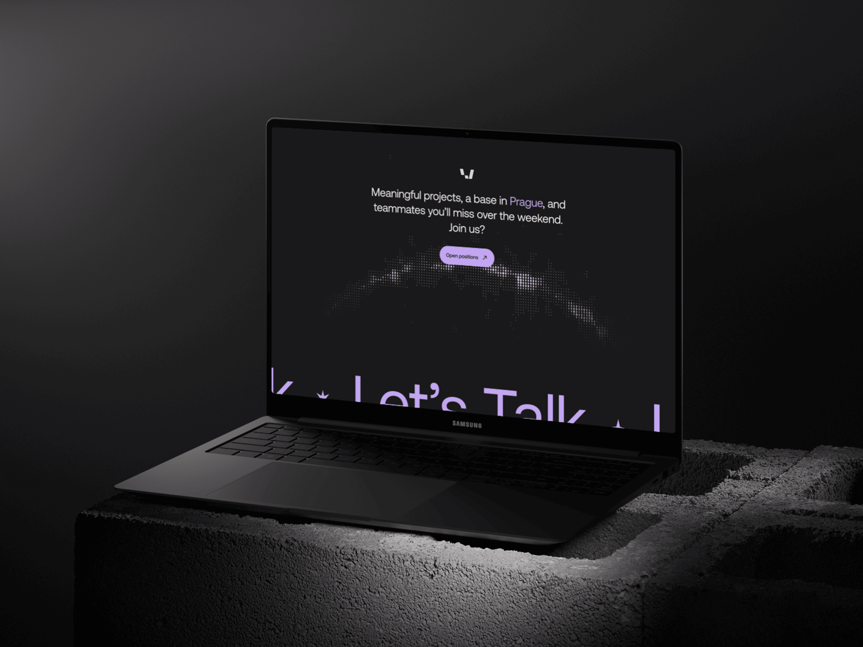
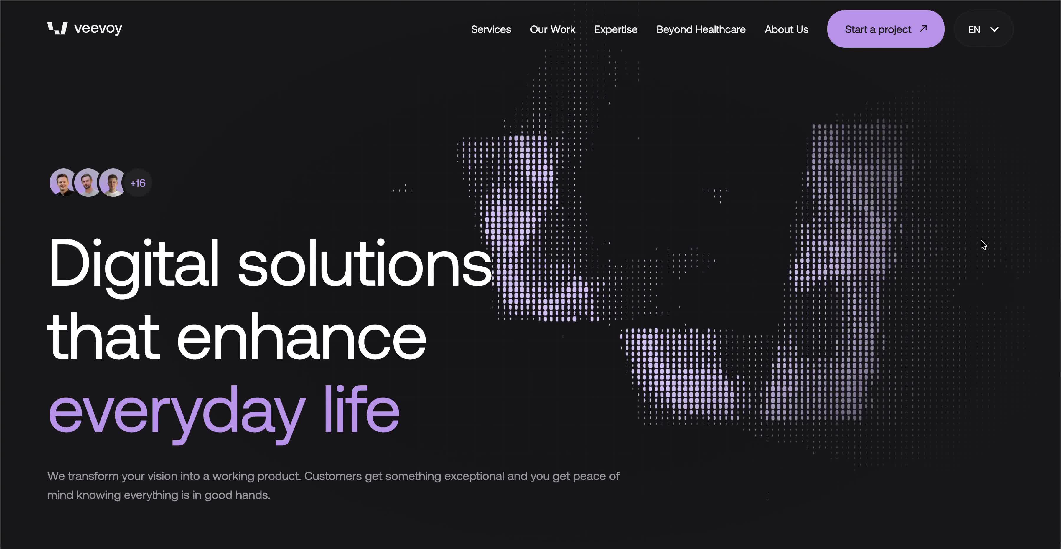
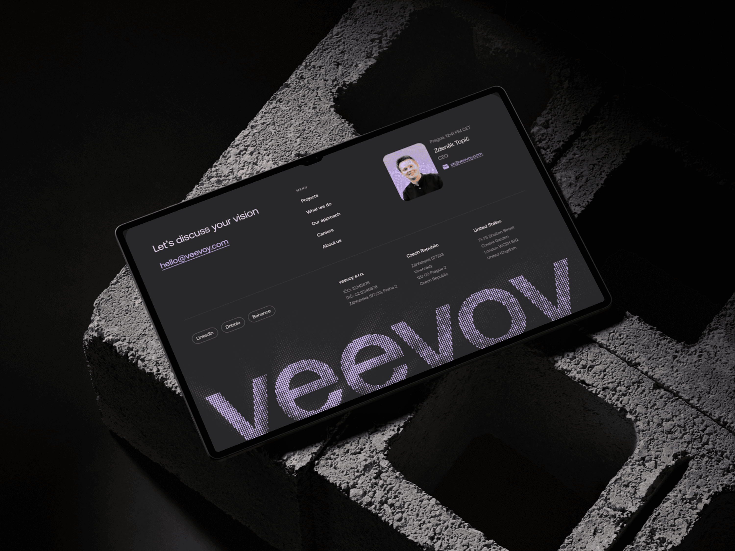
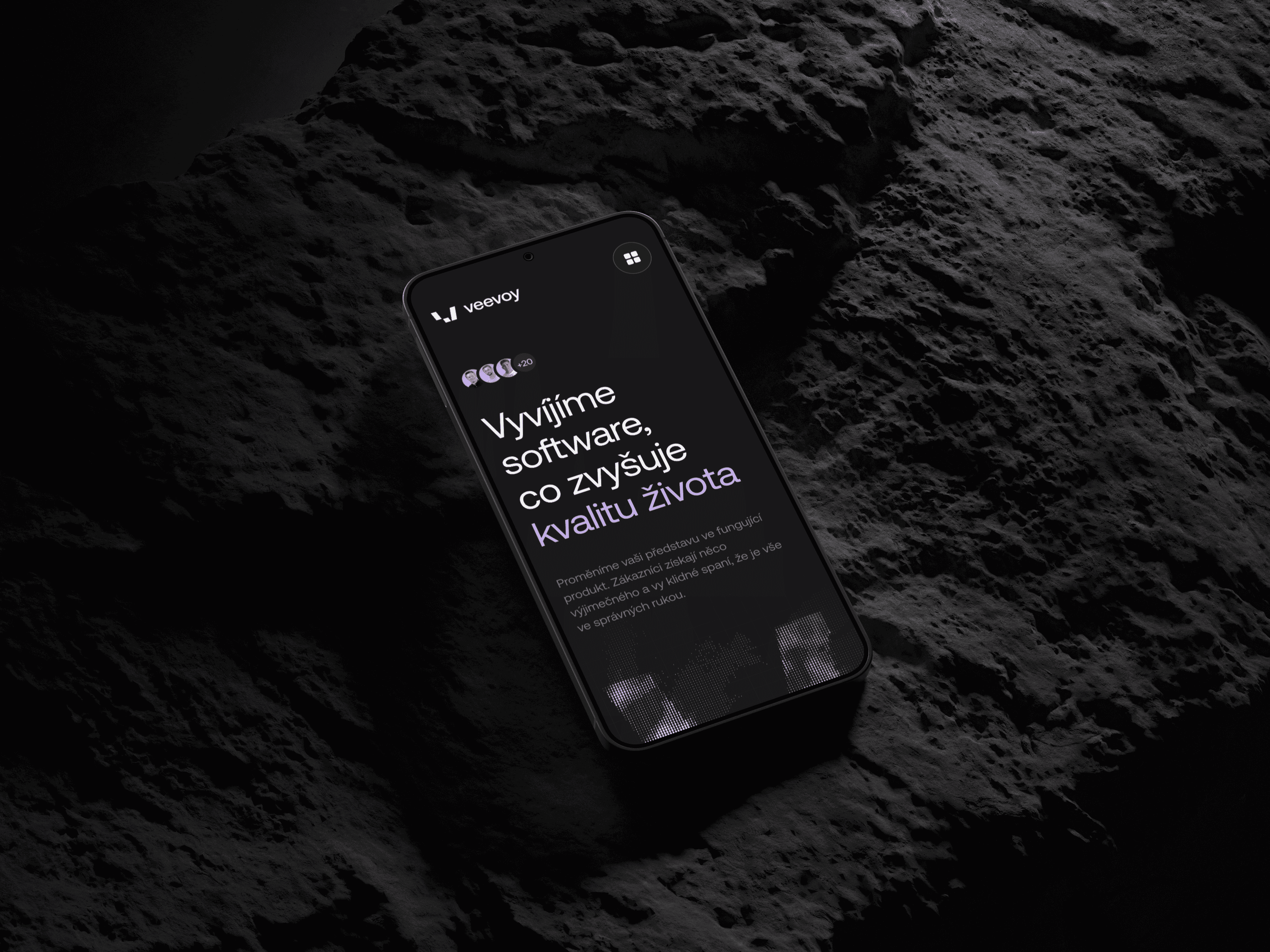
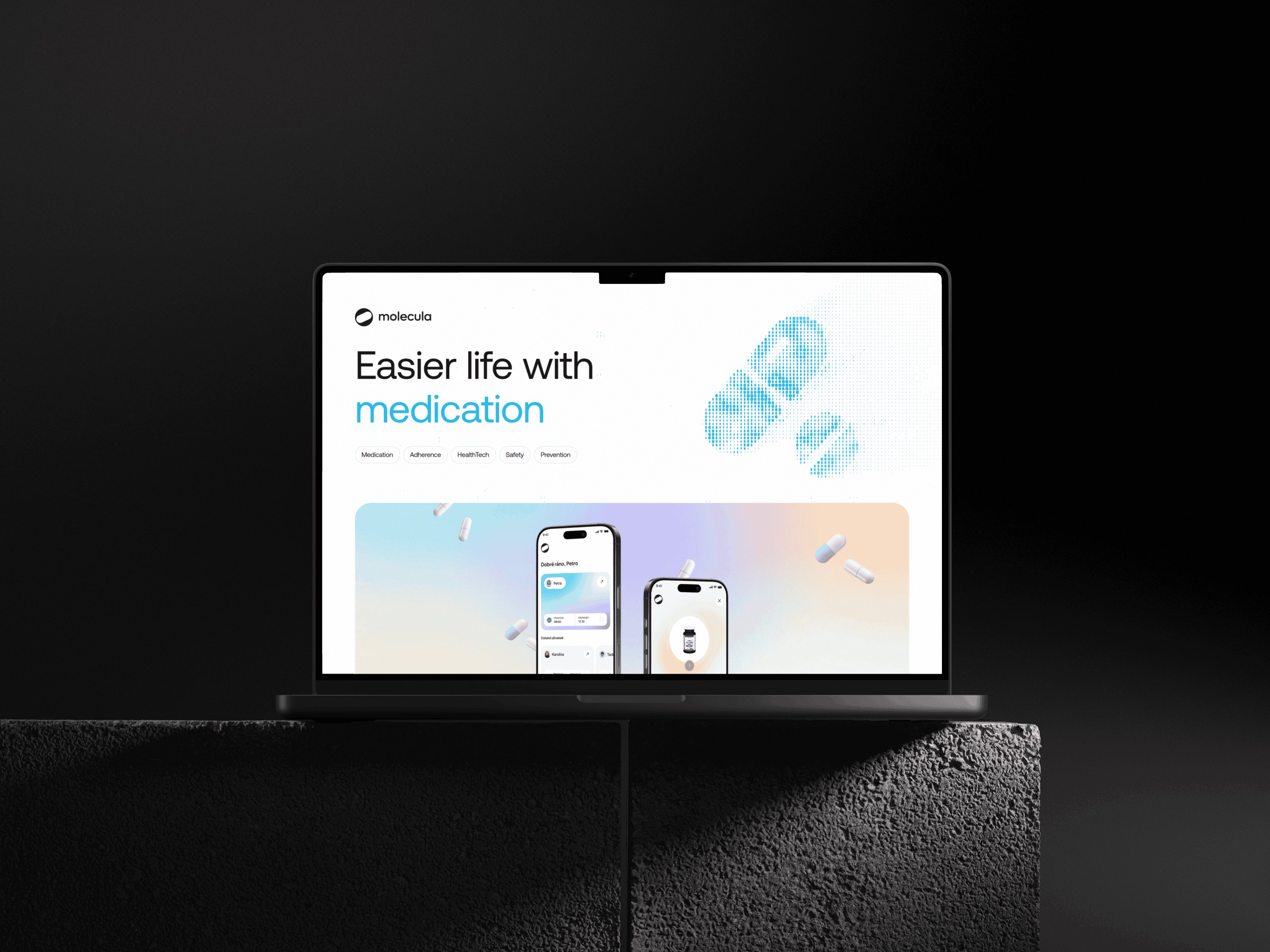
The result was an interactive / animated brand element created in Unicorn Studio. It helps the website feel more dynamic, technological, and memorable, while still keeping the overall experience professional. The element works as a visual motif that connects different parts of the website and can also be used outside of the website itself.
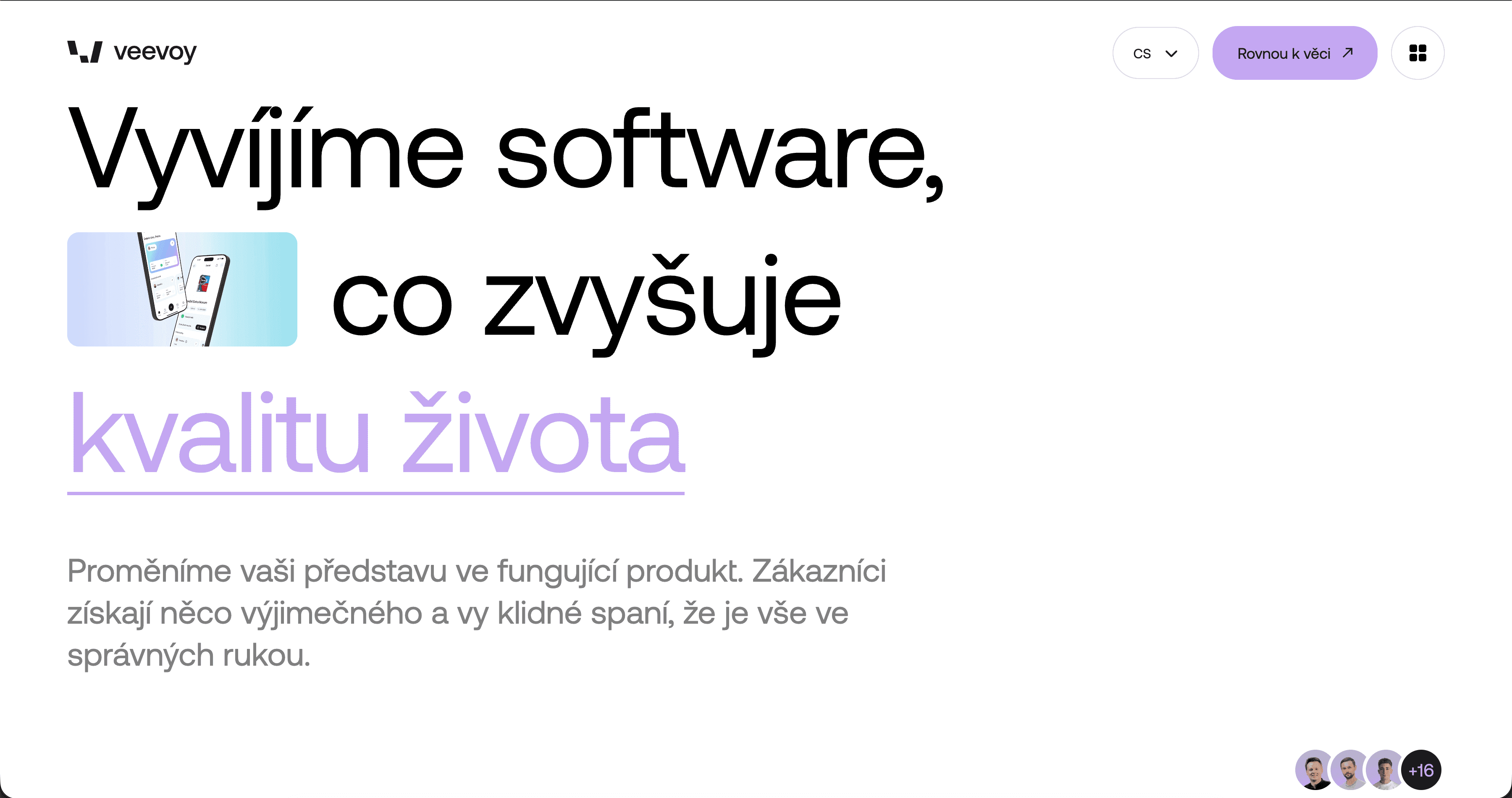
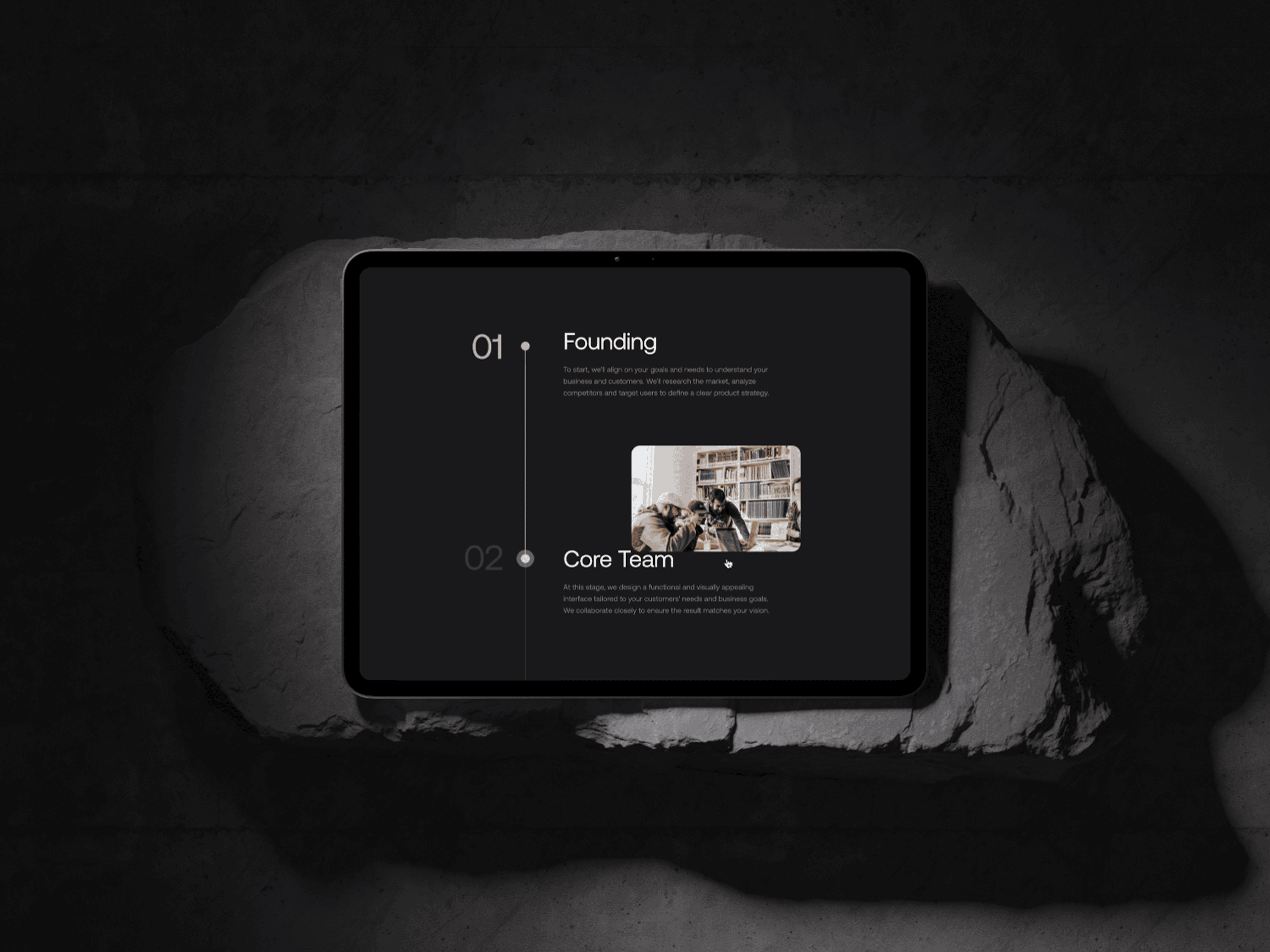
At the same time, I updated selected existing pages and designed new parts of the website. I focused on stronger visual hierarchy, more consistent content structure, and a more distinctive presentation of the agency's services. The key was to make the new additions feel like a natural evolution of the existing website, not a disconnected redesign.
Outcome
The result is a more distinctive website that keeps the original foundation but adds a clearer brand character. The new brand element helps Veevoy feel more modern, memorable, and recognizable within the software agency space.
The project also created a flexible visual system that can be used beyond the website, including social media, presentations, and other brand materials.
The website has not been publicly launched yet, so performance data is not available at this stage.


Let’s work together
